
Our last article raised the issue of how regulators may shape financial institutions’ approach to AI/ML. In this article, we’ll look at an area of data science practice that may not grab as many headlines as the sophisticated algorithms of AI/ML but is just as important for a company’s overall ability to achieve success: data visualization. Once a team has all the necessary data and performs their analysis, they must persuasively and accurately communicate results. Even significant data and powerful models are worth little without effective vehicles for conveying insights.
The Power of Data Visualization
The finance industry is often concerned with viewing data over time. However, even a small set of data points can defy quick interpretation. By rendering data visually, data scientists attempt to make it easier to explore features of the data and compare data sets.
Consider the following simple examples. In addition to the tabular data, we’ve provided summary statistics, total amount, and average amount, which suggest that the transaction behavior of these customers over this period is quite similar.

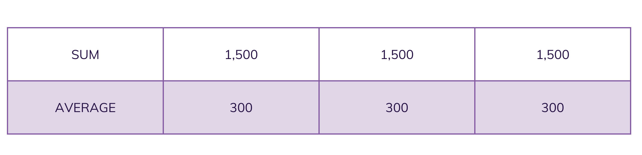
However, visualization of these three time series immediately tells a very different story: the first customer shows a consistent increase in transactions, the second illustrates a spike in activity, and the third’s activity rises and falls.


These differences in transaction activity might suggest courses of action for each individual, depending on the analyst’s focus or audience. For example, a marketing team might further examine information about the third individual to investigate the reason for the decline and bring the customer back. A compliance team might see the second individual’s spike in activity as the most potentially risky and explore the drivers of the unusual activity. While rules or statistical models could also detect these patterns, exploratory data analysis through visualization provides insights to inform the development of such capabilities.
From Visualization to Storytelling
Of course, data visualization is also often used for explanatory purposes. For this purpose, data scientists and analysts should address the key concerns of the audience and the decisions to be made. Visualizations should immediately draw audiences to the core insights or questions they pose, conveying a narrative supported by the data, providing context for the analysis, and revealing actionable insights. Let’s look at a recent example from the data journalism team at The Economist:
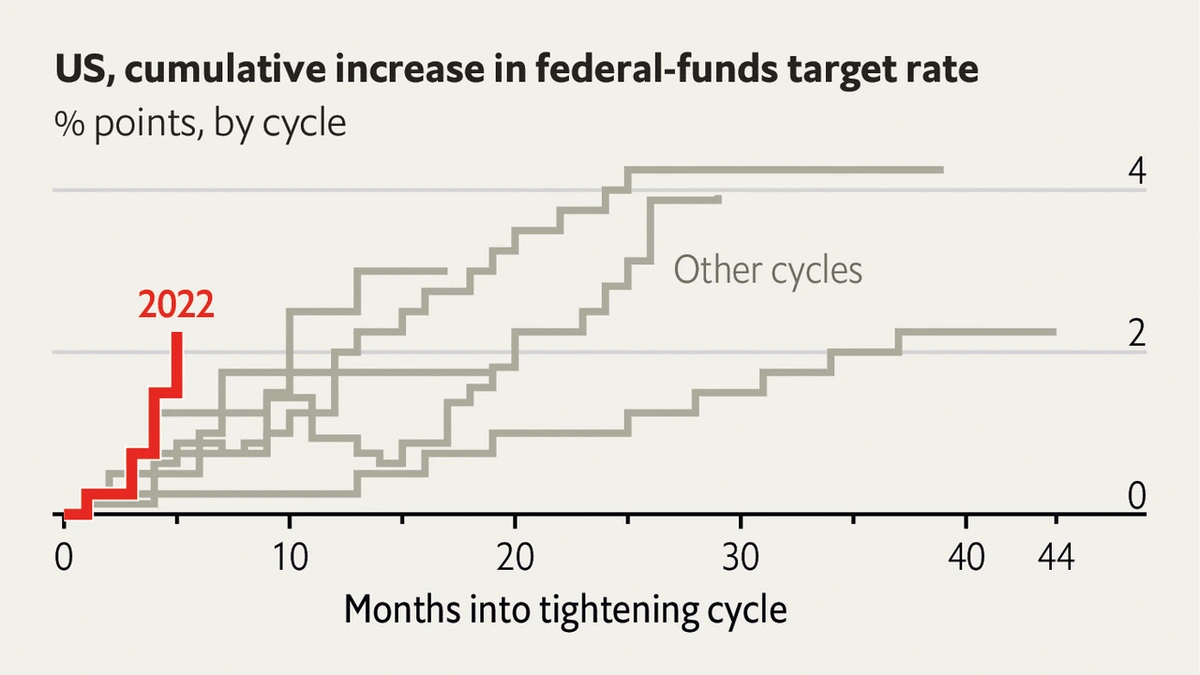
This visualization overlays several periods of rate increases by the Federal Reserve. Its simple use of color effectively highlights the sharper rise in rates in the current cycle of tightening compared to prior cycles. The message is not stated directly in the visualization but comes through clearly. In keeping the chart simple, this example shows good data visualization practices, generally omitting “chart junk” — like extraneous lines and labels — and visual clutter — such as varying colors or shapes — that would distract from the straightforward message of the visualization.
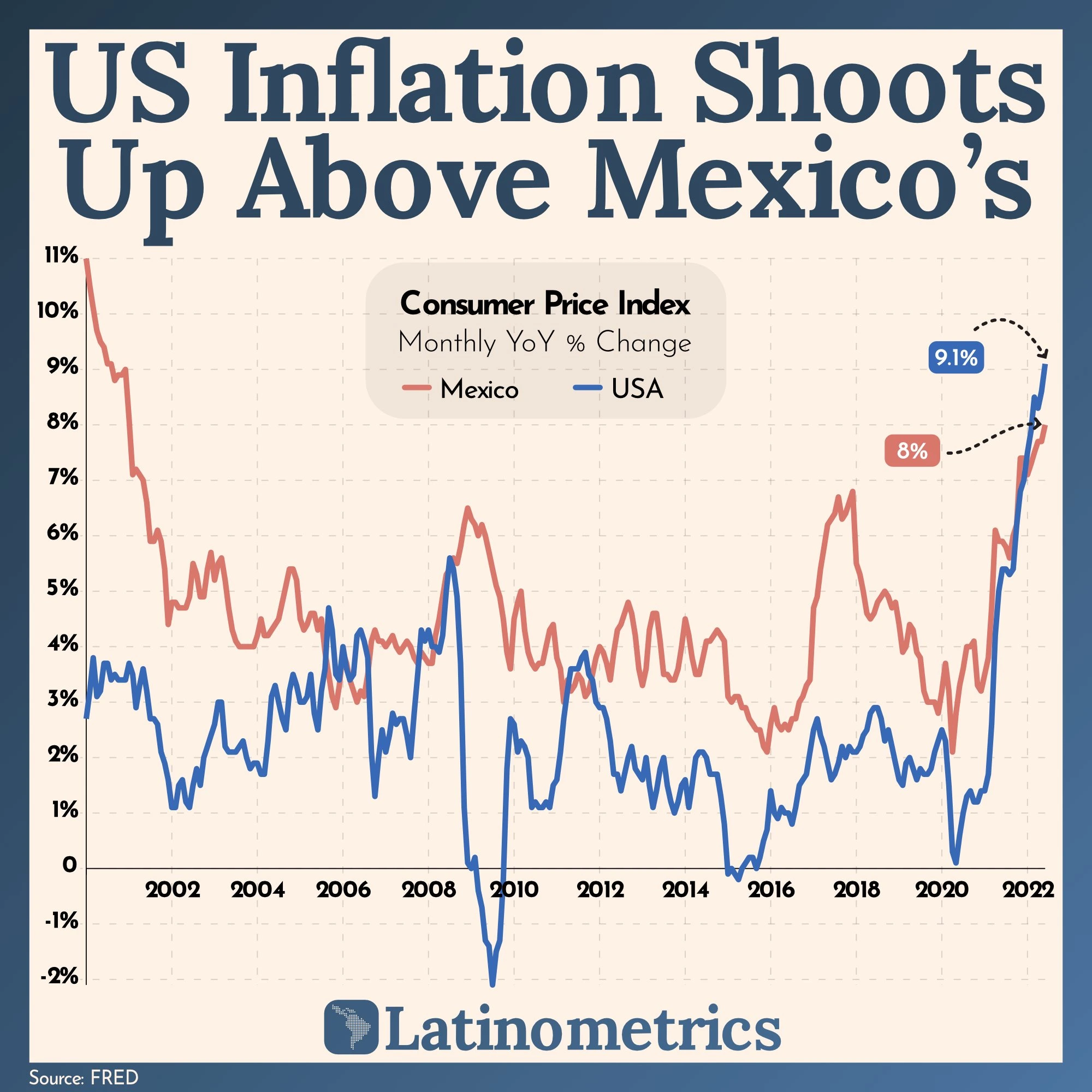
Following the inflation theme, let’s see another example from the Latinometrics newsletter (also posted to Reddit’s DataIsBeautiful, a popular thread for data visualization enthusiasts):
The chart compares two time series and highlights that U.S. inflation now exceeds Mexico’s. Labels for the latest inflation values are in colors that match the respective lines. A visual design expert might have some quibbles: the dotted line grid in the background and the arrows pointing to the values of interest seem unnecessary. The presence of historical instances where inflation in Mexico was higher than U.S. inflation may also undercut the substance of the message. Could a chart of the difference between the inflation rates more clearly communicate the significance of the situation? Would it be helpful to note the events driving each similar instance? These questions may lead to iterations of the visual that more wholly and effectively tell the story of the data.

As we’ve discussed, data visualization can be powerful as an exploratory and explanatory tool for any data science challenge. Both aspects are potentially present in the vast number of reports financial companies generate to inform management and regulators about the state of the business. However, formal reporting is often static, provided in spreadsheets or presentation slides based on long-established templates. These existing formats may be fundamentally limited in their visual design and fail to leave enough room for analysts to use the reported data to communicate a strong narrative. Any team producing a regular report should consider ways to enhance the template or establish conventions within the confines of the report for using effective visualization techniques because every report is potentially an opportunity to drive new thinking and sound decisions. Even regulators, who may require certain “raw” data sets as inputs to their analysis, might consider how existing templates could be adjusted to deliver more immediately accessible insights while meeting reporting obligations.
In addition to static data visualization and reporting, companies often use business intelligence (BI) tools to provide dynamic visual reports, commonly called dashboards, on business processes. The BI landscape is extensive, including licensed software, such as Tableau and Microsoft Power BI; custom dashboards built in open-source programming languages, such as Python, R, and Javascript; and reporting functionality available in other business and IT software, from CRM to ETL solutions. Each tool allows analysts to present a collection of tables, charts, text, and other visual elements. As with static reports, it is important to apply visual design and storytelling principles to dashboards. For example, how often have we seen a dashboard with numerous charts and filters but no clear objective or message? What is the insight, or range of insights, a user can be expected to take away as they move through the various elements on the dashboard? A BI tool should serve as a storyboard where teams can use multiple visual elements to craft a clear and compelling narrative, not simply a place to park a series of unrelated charts. Where dashboards are based on potentially stale templates, teams should look for ways to update the visual design and the data sources and analytical techniques “behind” the dashboard to guide their audiences to actionable insights.
Whether data visualizations are created in a BI tool or on a whiteboard, communication of data-driven insights rests on visual design principles and the ability to craft a narrative. Success in this endeavor rests not only on the analyst or data scientist’s proficiency, but also on the common vocabulary shared by peers, managers, and executives. Financial companies and regulators should also set expectations for regular reporting that doesn’t just update a few data points but tells the story of the data. A deeper understanding of the power of data visualization and storytelling ultimately strengthens decision-making across the enterprise.

Driving Digital Transformation in Financial Services
White Paper
Digitization is redefining our experiences in all aspects of life, from how we work to our expectations as consumers. Responsibly applying AI and ML tools to processes that shape such critical functions as lending decisions, risk assessment, compliance, and customer service requires a data-savvy workforce. A solid foundation of data science skills will help financial services organizations safely navigate this new digital terrain.